The most common request I hear from clients is: “Make us a beautiful website.” This is a completely understandable desire. Design is the first thing a visitor sees; it’s the “clothes” by which you are judged.
But here’s the problem: a beautiful website and an effective website are not always the same thing. Imagine a luxuriously decorated restaurant with no menu and no waiters. It looks great, but will you eat there? No.
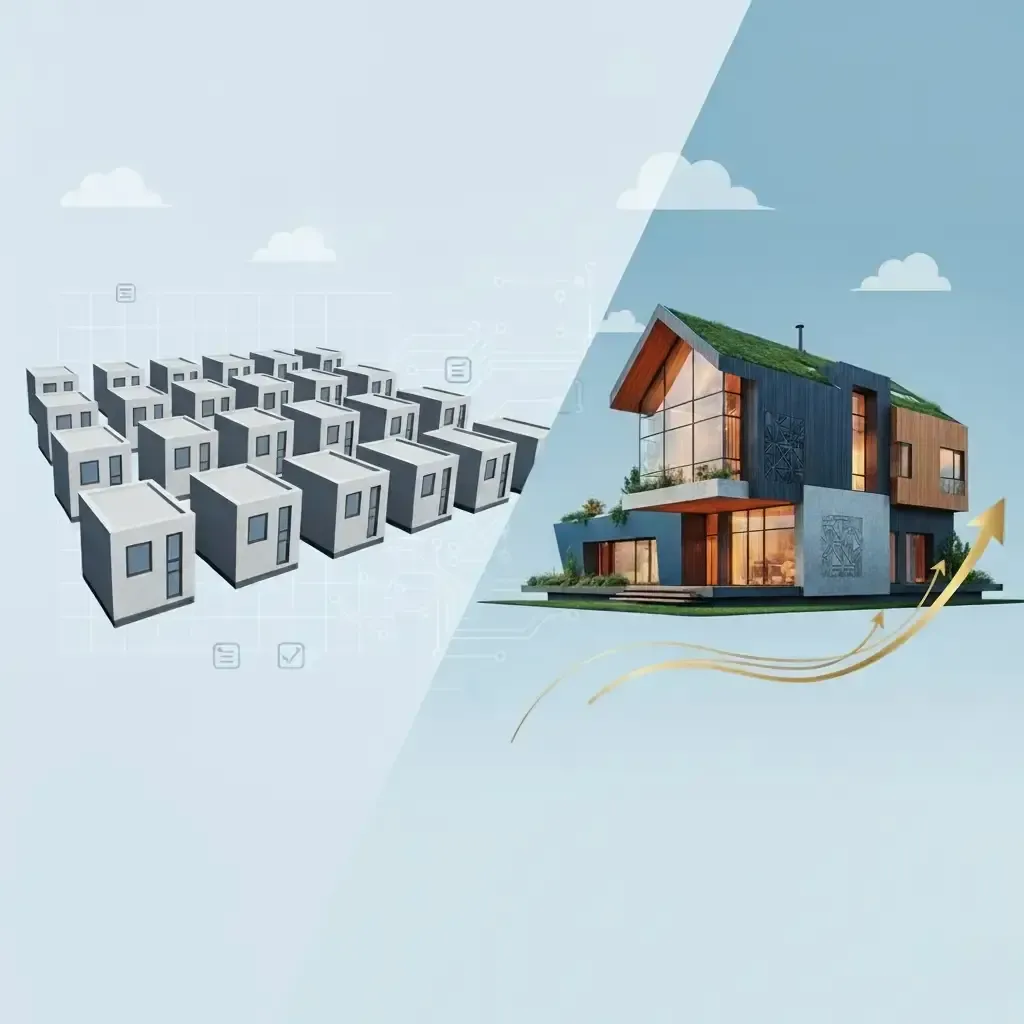
A real business website isn’t a painting; it’s an engine. And this engine has 7 essential components without which it simply won’t start.
In this article:
- Value Proposition: Capturing Attention in 5 Seconds
- Social Proof: Why They Should Trust You
- Technical Foundation and Mobile Optimization
- The Ideal Contact Form Checklist
1. A Clear Value Proposition (UVP)
You have 5 seconds. That’s how long a user takes to decide whether to stay or leave. They must instantly understand:
- Who are you?
- What exactly do you offer?
- Why should I choose you?
Avoid vague phrases like “Innovative Solutions.” Be specific.
Expert Tip: Your UVP should be the first thing a person sees on the hero screen. For example: “I design ERP systems in 40 days with a ROI guarantee.”
2. An Obvious Call to Action (CTA)
Don’t make the client think. Every section of the site should end with a logical next step. This is your Call to Action (CTA). Buttons like “Discuss Project” or “Get a Quote” should be prominent and repeated in strategic locations.
3. Social Proof (Portfolio and Testimonials)
Before clicking that button, a visitor asks: “Can I trust them?”
- Case Studies: Not just pictures, but a story of problem-solving. This is a prime example of how architecture solves business challenges.
- Testimonials: Real words from real clients.
4. Seamless Mobile Adaptation
Today, up to 70% of traffic comes from smartphones. If your site “breaks” or buttons are too small, you’re losing 7 out of 10 leads. Google uses Mobile-First Indexing, so a poor mobile experience automatically drops your search rankings.
5. The “Invisible” Technical Foundation
This is what can’t be seen but can be felt:
- Load Speed: If a site takes longer than 3 seconds to load, 40% of users leave. We use Astro to achieve 100/100 scores in Google PageSpeed.
- SEO Structure: H1-H3 headers, meta tags, and clean code—these are what help promote your site in search results.
6. A Simple and Working Contact Form
The form should be ridiculously simple. Name, contact, and message. Fewer fields = more leads.
Key Insight: Ensure notifications actually work. In my projects, leads are instantly mirrored to Telegram so a manager can respond within 5 minutes.
7. The “Boring” Pages (Legal)
Privacy Policy and Terms of Service aren’t just bureaucracy. For search engines, these are signals that you are a legitimate and reliable company. This increases the overall domain authority and trust.
Conclusion
An effective website is a system where design assists the user, text persuades, and technology makes the process fast and reliable. When all 7 elements work together, your website transforms from a pretty picture into a high-performance sales engine.
Want to check your website’s effectiveness? Contact me for a free express audit of your project’s structure.
Read also: 5 Principles of Modern Development